
Into The Spider-Verse: Animation Techniques and Details
a reminder of why Sony Pictures' Spider-Man: Into The Spider-Verse took four years to make.

Introduction:
“With great ability comes great accountability.” — Jefferson Davis
When Spider-Man: Into The Spider-Verse swung into theaters, it not only captivated audiences with its story but also redefined the standards of animation. Building on the well-known, iconic stories of Spider-Man’s earlier films, this film brings back the nostalgia of Marvel comics with its eye-catching and distinctive animation style.
In honor of Spider-Man: Into The Spider-Verse nearing its sixth anniversary, this post will explore the sophisticated animation techniques and artistic choices used to create the film’s jaw-dropping visual appearance. While these small details are subtle and often go unnoticed by viewers, they contribute much to the film as they reveal more about the plot and main personalities of this exciting Spider-Man adaptation.
The Distinctive Comic-Style Aspects
One of the main contributors that differentiates Spider-Man: Into The Spider-Verse from other animated productions is the unique and distinctive comic-style animation. The animators and VFX artists of Sony Pictures cleverly combine creative techniques and details such as onomatopoeia and halftone effects to create the comic-like film.
2D Hand-Drawn Frames + Onomatopoeia
When watching this engaging Sony Pictures production, here’s a tip: don’t blink! Most, if not all, action sequences in this animation feature colorful and distinctive 2D hand-drawn frames combined with bold onomatopoeia lettering. These striking frames emphasize certain movements and poses, usually used in action scenes.
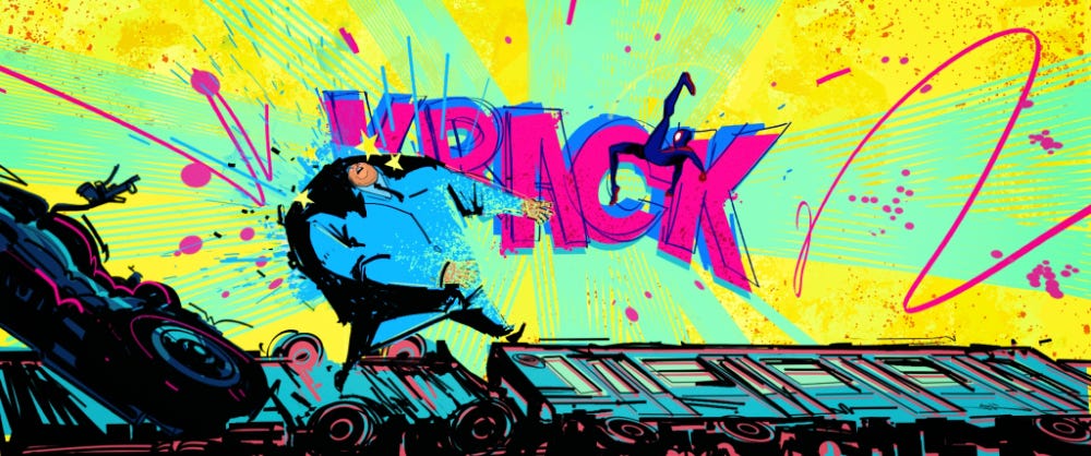
In these bright frames, the drawing style varies depending on the character shown. For example, the frame featuring Miles in action displays a spray painted and graffiti-like art style, reflecting his graffiti artistry that he had with his Uncle Aaron. While the other frame contains halftones and comic-like features that reflects Peter Parker (the Ultimate Spider-Man) as he was the first original Spider-Man in his universe.
Half-Toning & Line-Hatching
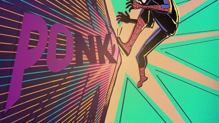
Inspired by many classic Marvel comics, the creators of the Spider-Verse incorporated the technique of half-toning and line-hatching that were commonly used in comic books. Throughout the film, these techniques were used in many unique ways to help the visuals stand out.

What is half-toning and line-hatching? Halftone is a visual and printing technique that creates the illusion of a subtle gradient effect through the repeated pattern of small black and white dots. On the other hand, line-hatching is artistic technique where closely drawn parallel lines were used to make shading or tonal effects. While hatched lines portrayed as shadows within the motion picture, halftone dots were applied to simulate a light source (as seen above).
Depth of Field: The Mis-Printing Method
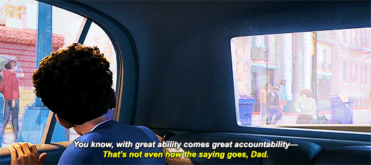
The mis-printing method is a visual technique (or mistake) often used in comics where colors or images are slightly unaligned or imperfectly printed. This method was intentionally applied to the visual style of the animated feature and creates a distinct, layered effect that mimics the vibe of a traditional comic book. Although the mis-printing method adds a unique aesthetic to the film, it was also cleverly used to enhance the depth of field. Due to this, the layers of the background are often misaligned and slightly blurred which shifts the audiences’ attention to the intended focal point.

A clear example of this method being utilized is when Miles’ looks out his car window to watch the breaking news. Viewers can observe that the characters around the screen have a layered, misaligned effect that consists of muted and dark colors, while the screen itself has more clarity and is more visually vibrant. Through this visual effect, the audience won’t feel overwhelmed and can easily find the center of attention from this crowd of people.
Frame Rate: Twos & Ones
Apart from the vibrant, comic-style animation, one of the most significant details within the visuals of the film is the alternating frame rates. In most animated films, the frame rate is usually twenty-four frames per second, where each scene is individually animated on every frame (also known as animating on ones). However, Spider-Man: Into The Spider-Verse creatively portrays the characters by manipulating the frame rate to display contrasting personalities.
During Miles Morales’ journey of discovering his astonishing, yet embarrassing, abilities, it is often noticed that Miles’ frame rate is choppier and slower than most characters. While most characters are animated on ones, Miles is animated on twos, meaning his animation pose changes every two frames.
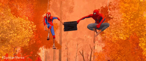
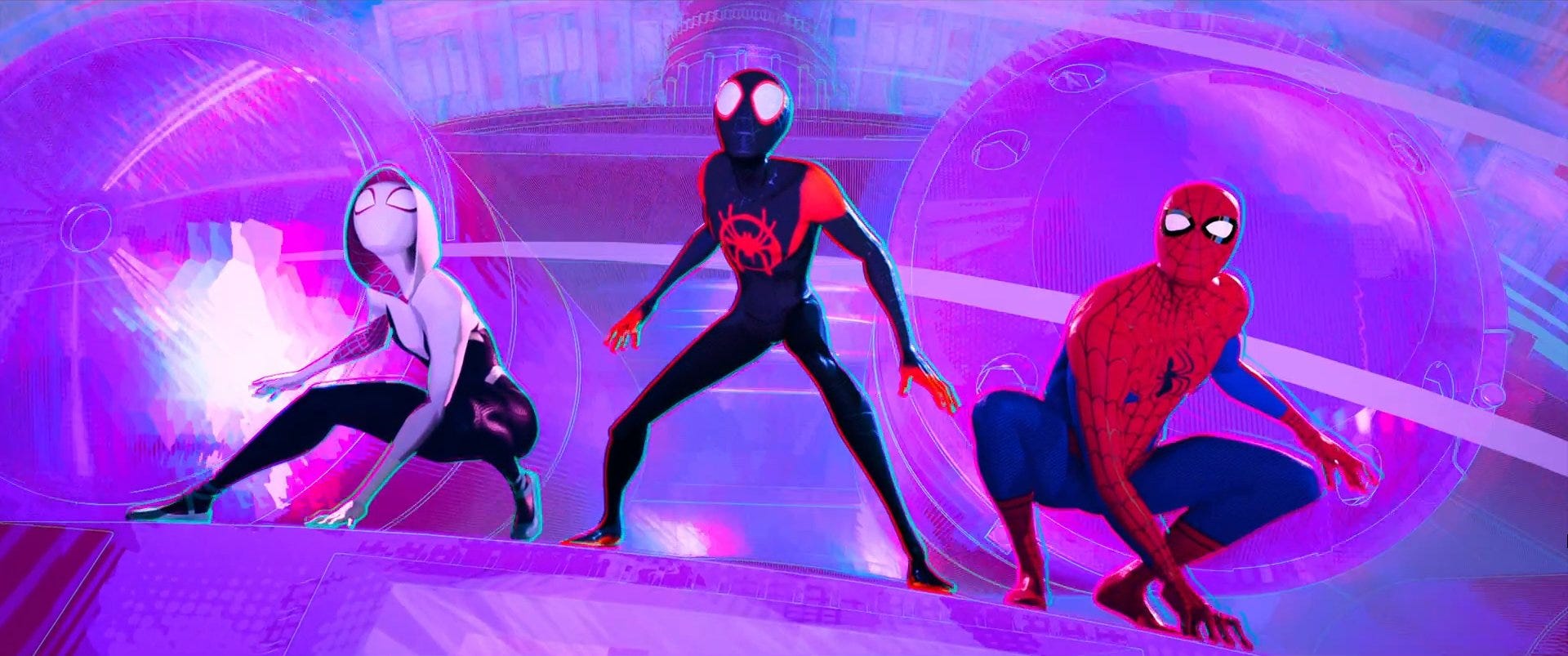
When Miles completes his first mission as Spider-Man, he and Peter B. Parker try to escape from Dr. Olivia Octavius. As both Spider-Men swing side by side in this sequence, the difference in frame rate becomes more prominent.
Due to Peter’s twenty-three years of experience serving as Spider-Man, he is smoothly animated on ones, while Miles is animated on twos. The contrast in frame rate highlights Miles’ inexperience compared to Peter’s fluid motion. Although animating on twos is a faster and easier way to animate, this unique feature plays a key role in Miles’ story as it portrays him as a clumsy, awkward new Spider-Man compared to the more seasoned Spider-People. However, when Miles finally took a leap of faith and became more confident with himself, he can be seen animated on ones to emphasize his development throughout the film.
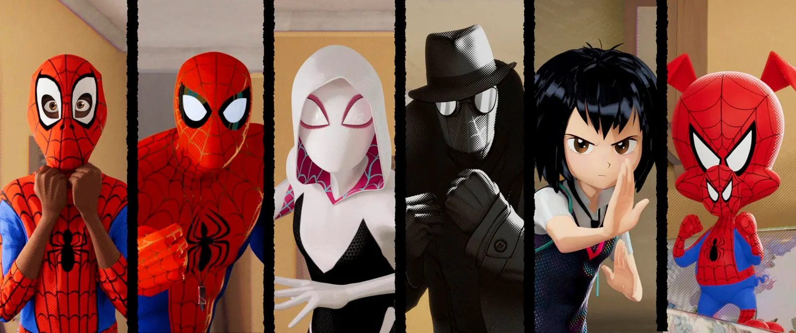
Stylized Characters: Spider-People
Last but not least, we have the Spider-People! The Spider-Verse, of course, consists of diverse universes, each featuring it own distinct characters and stories. In the live-action movies, the Spider-Verse is more limited on how to showcase the different Spider-Men. Besides using different actors and costumes, these movies don’t have the same creative freedom to explore diverse interpretations and personalities of each Spider-Person as seen in the animated versions.
Starting off with the main character, Miles Morales, a groundbreaking addition to the Spider-Verse. As Miles goes through the journey of self-discovery and newly found powers, his artistic animation style displays his improvement from a stiff and awkward character to a dynamic and fluid one. Miles additionally showcases his determination and creativity through his sleek black and red suit that features the iconic Spider-Man symbol with a bold graffiti, spray painted style.
Next up is Peter B. Parker, the older and more jaded version of Spider-Man. Peter’s long and seasoned experience as Spider-Man can be showcased through his smooth, yet slow-paced character animation. Although he is often known as the “janky, old, broke, hobo Spider-Man”, he also shows his humorous side through his sarcastic and over exaggerated facial expressions. Along with this, Peter’s character design—from his slouchy posture to his worn-out sweatpants—displays that he’s been through some tough times.
Then we have Gwen Stacy, also known as Spider-Gwen. Despite the fact that Gwen, Peter, and Miles were all animated on the same physical world, Gwen’s distinctive style sets her apart with her signature hoodie and ballet flats. Her simple yet bold character elements highlight her enhanced agility and fluidity when in action. Besides that, the designers of Gwen’s suit chose not to include the traditional spider symbol; instead, they incorporated the spider element into her entire suit.
Another intriguing character is Spider-Man Noir, a darker take on the web-slinger. Set in the early 1930s, before the invention of colored TV, Noir’s story is set in a monochromatic world during the days of the Great Depression. The high-contrast lighting adds long shadows which captures the classic film noir style that emphasizes the tragic, corrupted, and crime-filled universe. Noir’s trench coat and fedora not only enhances his detective persona, but also his serious and tragically passionate demeanor.
Let’s not forget Peni Parker, a young girl who pilots her father’s robot that is powered by a radioactive spider. As Noir’s universe is set in the 1930s, Peni’s story takes place in the futuristic 3100s. Drawing from her Japanese roots, her design and animation is inspired by the popular Japanese film style, anime, which features graphic art, dynamic camera panning, and elements of futurism. This blend of high-tech aesthetics and vibrant animations emphasizes her young, energetic personality and unique backstory.
Lastly, we have Spider-Ham, also known as Peter Porker—a fun and quirky cartoon version of Spider-Man in pig form. Apart from the other 5 Spider-People, Porker’s universe consists of a Looney Tunes inspired style, featuring comedic and cartoonish elements. Even in the most serious sequences, Porker’s silly animations show that not all heroes takes themselves too seriously, bringing a fun twist to the Spider-Verse.
The Bottom Line
To wrap it up, without these creative aspects and techniques in Spider-Man: Into The Spider-Verse, it wouldn’t have made such a significant impact on the animation industry like it does today. Though this film didn’t reach Avatar level success, it has definitely made cinematic history and even inspired many new and upcoming animated films, like Puss in Boots: The Last Wish & The Bad Guys, to divert from realism and embrace more stylized animation.
Resources:
Insider (YouTube) — How 'Spider-Man: Into The Spider-Verse' Was Animated | Movies Insider
WIRED (YouTube) — How Animators Created the Spider-Verse | WIRED
Vox (YouTube) — How "Spider-Verse" forced animation to evolve
Sony Pictures Imageworks - VFX (YouTube) — SPIDER-MAN: INTO THE SPIDER-VERSE - Animating Miles
Vulture — How Spider-Man: Into the Spider-Verse Changed the Animation Game
IndieWire — 'Spider-Man: Into the Spider-Verse': Breaking the Rules of Animation